



2. The Redesign
2. The Redesign
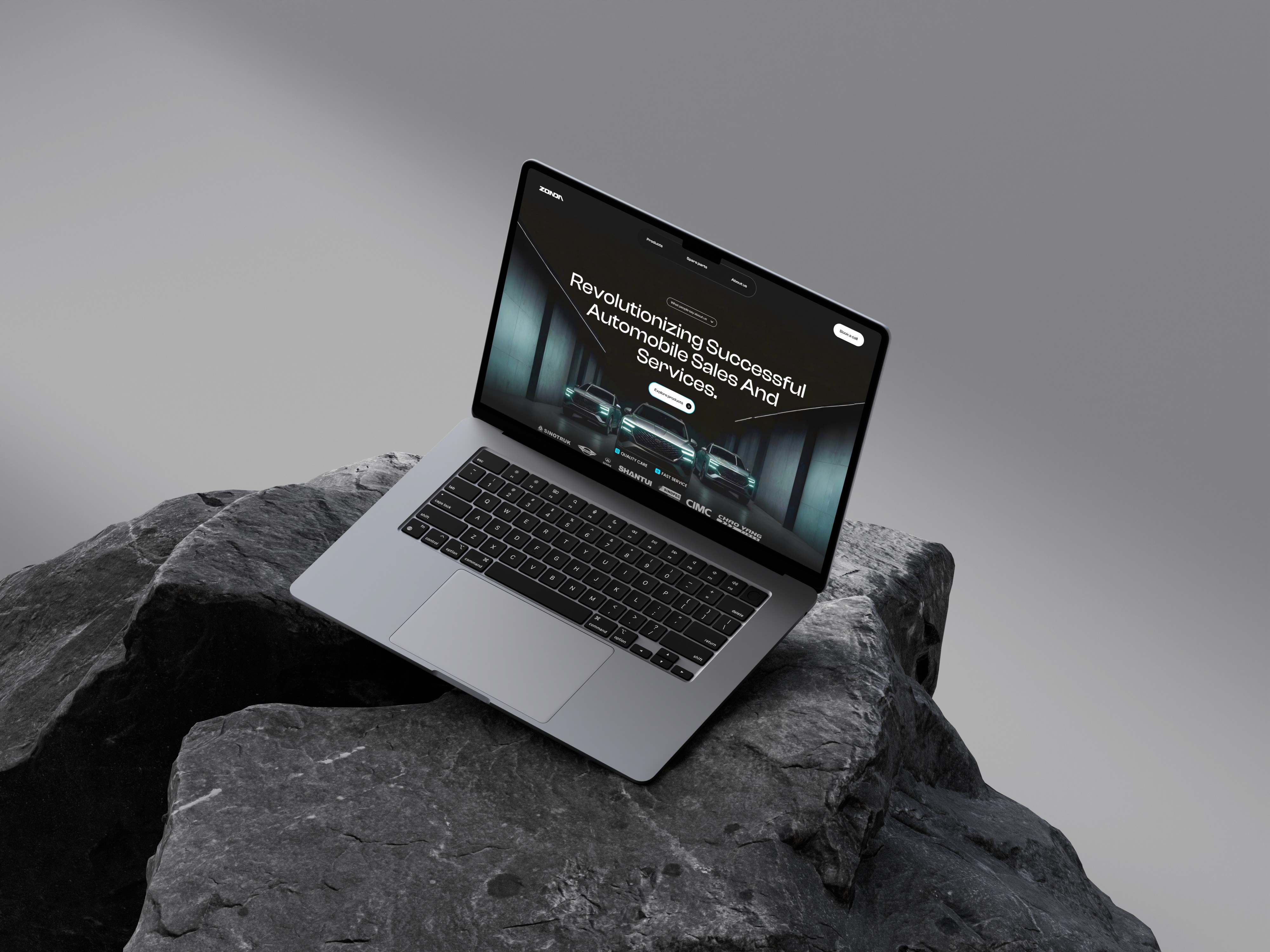
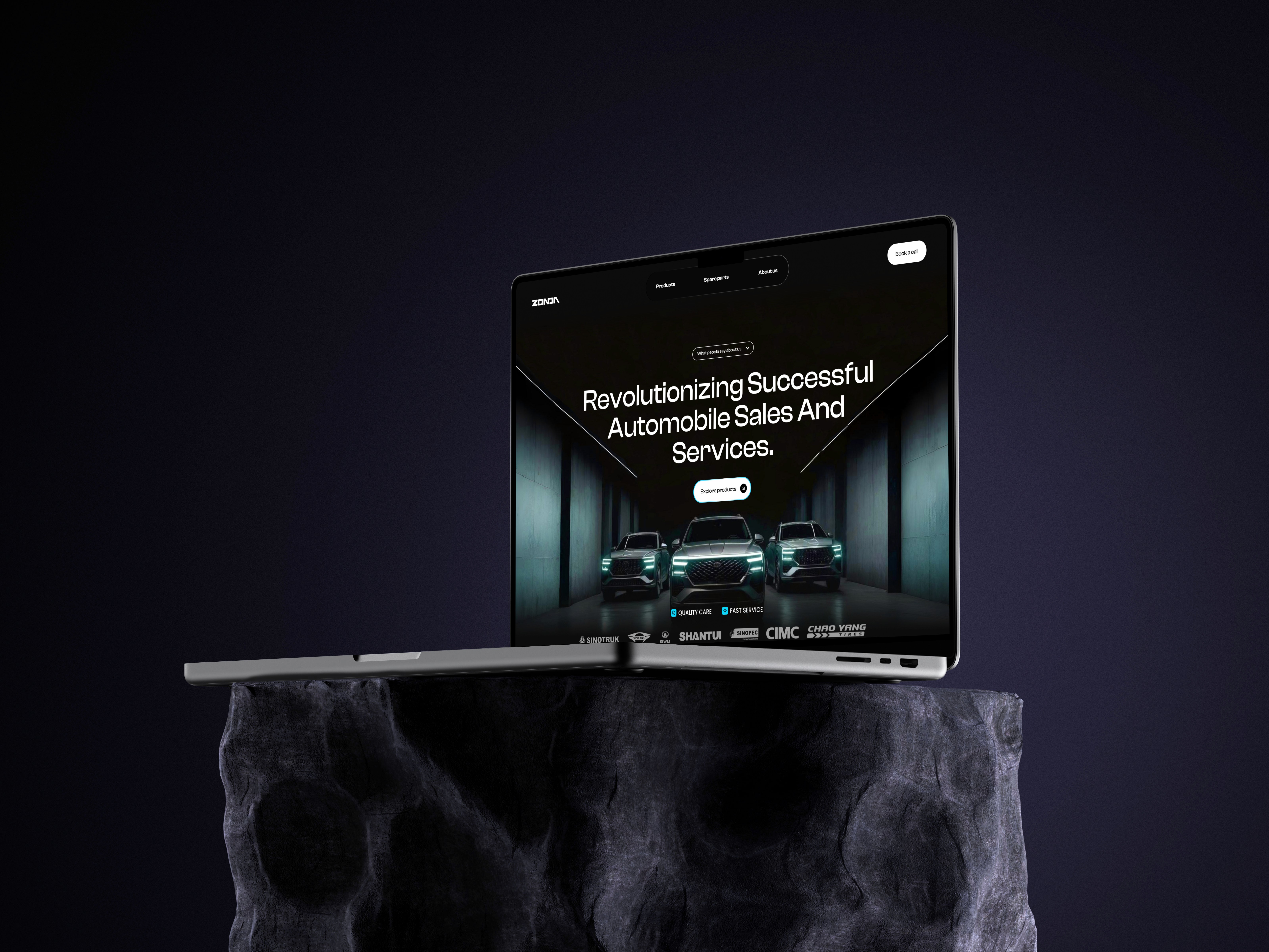
A premium digital gateway that redefines Zondatec’s presence in the automotive sales and services sector. Unlike the standard, cluttered layouts of traditional dealerships, this UI uses a cinematic, high-contrast aesthetic to position the brand as a leader in innovation. It’s not just a website; it’s an immersive environment designed to bridge the gap between heavy-duty engineering and sophisticated digital interaction.
3. The Execution
3. The Execution
The focus was on visual storytelling and intuitive hierarchy. By utilizing a bold, dark theme paired with sharp typography, I’ve created a "tech-forward" atmosphere that emphasizes both scale and precision. I streamlined the user flow—moving from high-level brand trust (partner logos and stats) to direct engagement (video content and CTA)—ensuring that whether a corporate client is looking for a fleet or an individual is seeking service, the path is clear and frictionless.
4. Why This Works
4. Why This Works
The "Luxury-Tech" Aesthetic: Moving to a dark mode with neon accents instantly elevates the brand from "service shop" to "automotive innovator."
Social Proof Integration: Placing partner logos (Sinotruk, Shantui, etc.) and the "10K+ Customers" stat prominently builds immediate authority.
Micro-Interactions: Elements like the pill-shaped "Explore products" button and the clean navigation bar suggest a modern, responsive feel that the original likely lacked.
Content Breathing Room: You’ve balanced heavy machinery imagery with generous white space (or "dark space") and clean sans-serif fonts, making the site feel high-end rather than overwhelming.
